Wireframes, sitemap & journeys
Based on the client’s sitemap Excel, with page wireframes and key visitor journeys.
Open wireframes
October 2026 / ©Flowout
Compare five homepage directions and their related versions.
The first follows the client’s structure; the others explore more creative approaches.
These previews show the page layout, visual style and example interactions. Some product images are illustrative. Once we agree the design together, the remaining page layouts and full website functionality can be developed.
The preview links are for reviewing the designs.
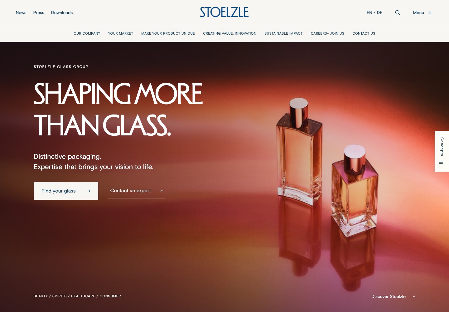
01 / CLIENT STRUCTURE / BRIEF COVERAGE
A working homepage showing the proposed menu and content sections. Use this direction to review what the site includes and how visitors find it.
Main navigation The seven main sections and their subpages, arranged in the order shown in the client’s sitemap.
Homepage sections The brand introduction, four markets, catalogue links, expertise, case studies, sustainability, innovation, news and events, plus careers and contact.
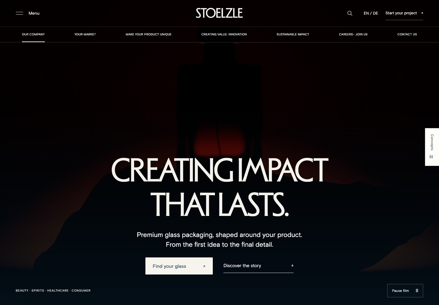
02 / MATERIAL & MEANING
A homepage that leads with product video and large photography. It combines the client’s menu and homepage content with sections on design, glass, decoration and closures.
Who it’s for Brand and marketing teams reviewing how Stoelzle presents its products, materials and glassmaking capabilities.
What you’ll see A video opening, photos that move as you scroll, changing product views and a video behind the final contact section.
View design with video ↗Compare three options for the top of the homepage.
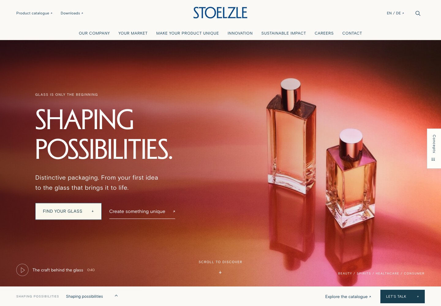
03 / PRODUCT DETAILS
A closer look at how a bottle comes together: shape, glass colour, decoration and closures. Each chapter explains a choice, with routes to standard products or a custom project.
Who it’s for Packaging buyers and product developers comparing standard bottles with a custom design.
What you’ll see A changing bottle beside focused explanations, service links, and a custom-project module that starts with your market and interests.
Explore product details ↗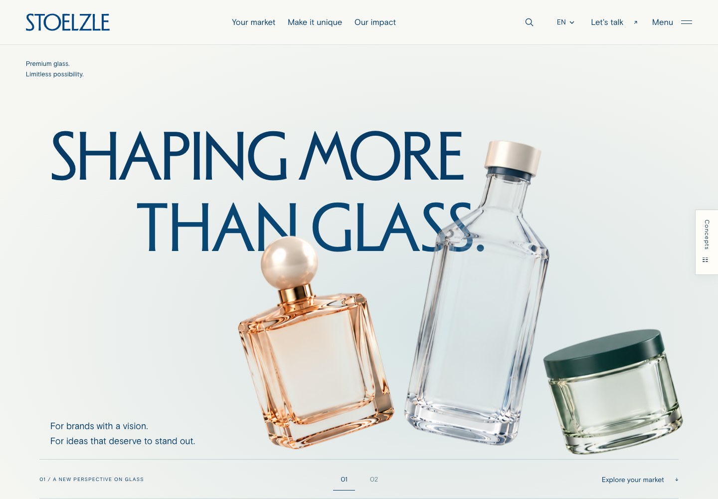
04 / PRODUCT SCROLLYTELLING
A homepage that unfolds through movement. Three products introduce the range, then the tall bottle becomes the focus as the opening moves into the story. Market tabs and product imagery continue the journey.
Who it’s for Brand teams and customers exploring the breadth of Stoelzle through a visual introduction to its products, markets and expertise.
What you’ll see Three floating products, a scroll-led opening that moves from the collection to a single bottle, and four markets with updated product imagery.
Open Editorial v3 ↗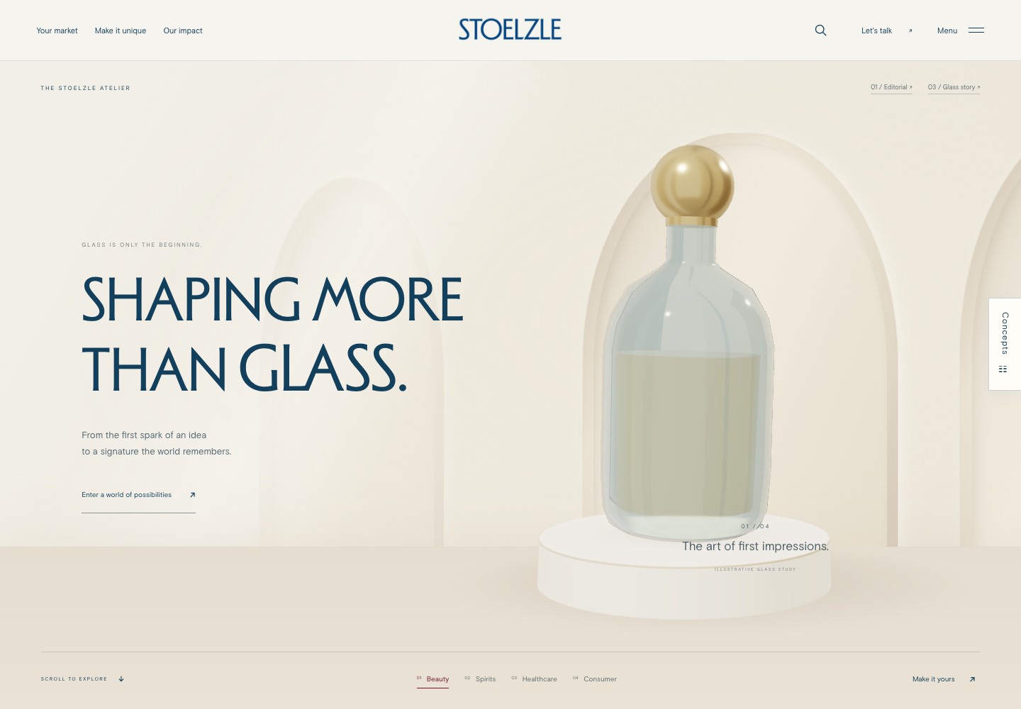
05 / THE ATELIER
A homepage that opens with glass bottles in a studio setting. Visitors can explore bottle colours and finishes, watch a short production film and follow links to products or a project enquiry.
Who it’s for Design agencies and brand teams exploring a custom bottle and looking for a creative partner.
What you’ll see A studio-style opening, colour and finish controls, a production video and links to products and contact.
Open The Atelier ↗Based on the client’s sitemap Excel, with page wireframes and key visitor journeys.
Open wireframesCompetitor websites to compare structure, content and visual style.
Open competitor overview