 Glass.
At scale.V12.B / OVERSIZED HEROOne oversized bottle, cropped at the bottom. A softly frosted dark gradient lets the headline sit over the glass. The editorial scroll story continues below; v12’s three-product hero remains a separate option.
Explore version 12.b →Material.
& Meaning.EDITORIAL / COLLAGE / SURFACE STORIES12 / BRAND & MATERIAL — NEW EDITORIAL↗ A three-product hero with the headline above larger, cropped perfume, spirits and healthcare renders; a curtain transition inspired by Fluid Glass; a centred headline over an expanding collage; changing bottle renders with warm studio and timber settings, inset product photography and subtle card reveals.
Explore version 12 → Shaping more
than glass.CLIENT STRUCTURE / DIRECTION 1111 / CLIENT STRUCTURE — EXACT HIERARCHY↗ The seven primary branches and nested navigation follow the client workbook. All homepage blocks required by the UX/UI brief are included, with catalogue, bespoke, case-study and careers paths.
Explore version 11 →Shaping
possibilities.PREMIUM STORY. CLEAR NEXT STEP.RECOMMENDED09 / BRAND & BUSINESS — RECOMMENDED↗ A continuous full-width scene pinned through a long scroll. Bottle and copy remain anchored as each expression and chapter fades into the next. A soft frosted area lets glass show through, with no hard column divider.
Explore recommended concept →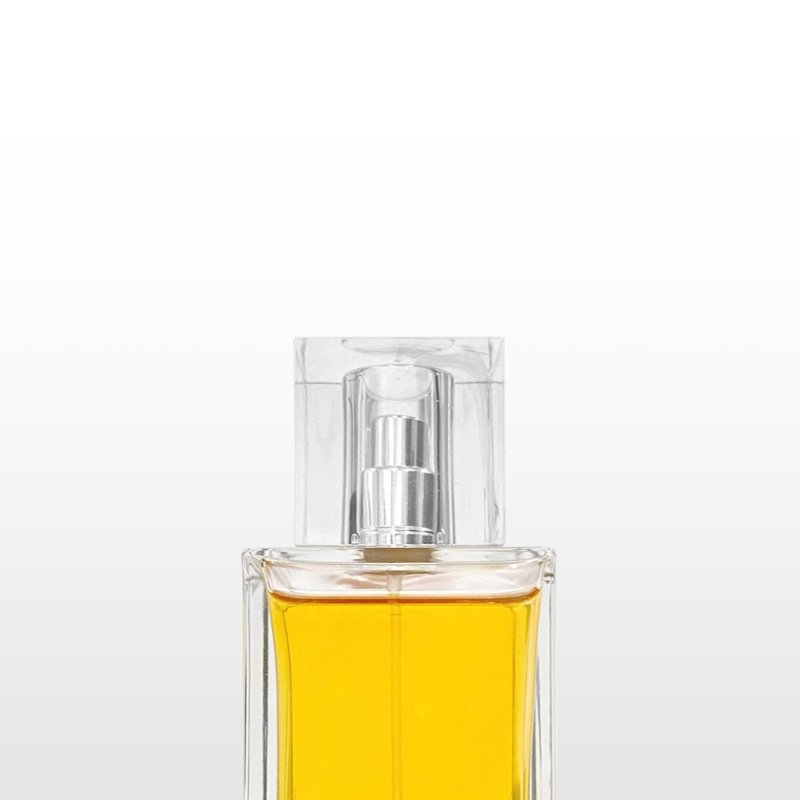 Shaping
more than
glass.Expressive typography, sculptural glass and an editorial introduction to Stoelzle.
Explore concept →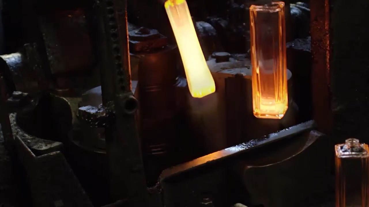 The atelier.FROM IMAGINATION TO GLASS
02 / PRODUCT & CO-CREATION↗ A warm, architectural direction with a live 3D bottle and an interactive customisation studio.
Explore concept →Shaping more
than glass.THE STOELZLE GLASS STORYFull-width cinematic storytelling. A chapter-led journey through the proposed client structure.
Explore concept →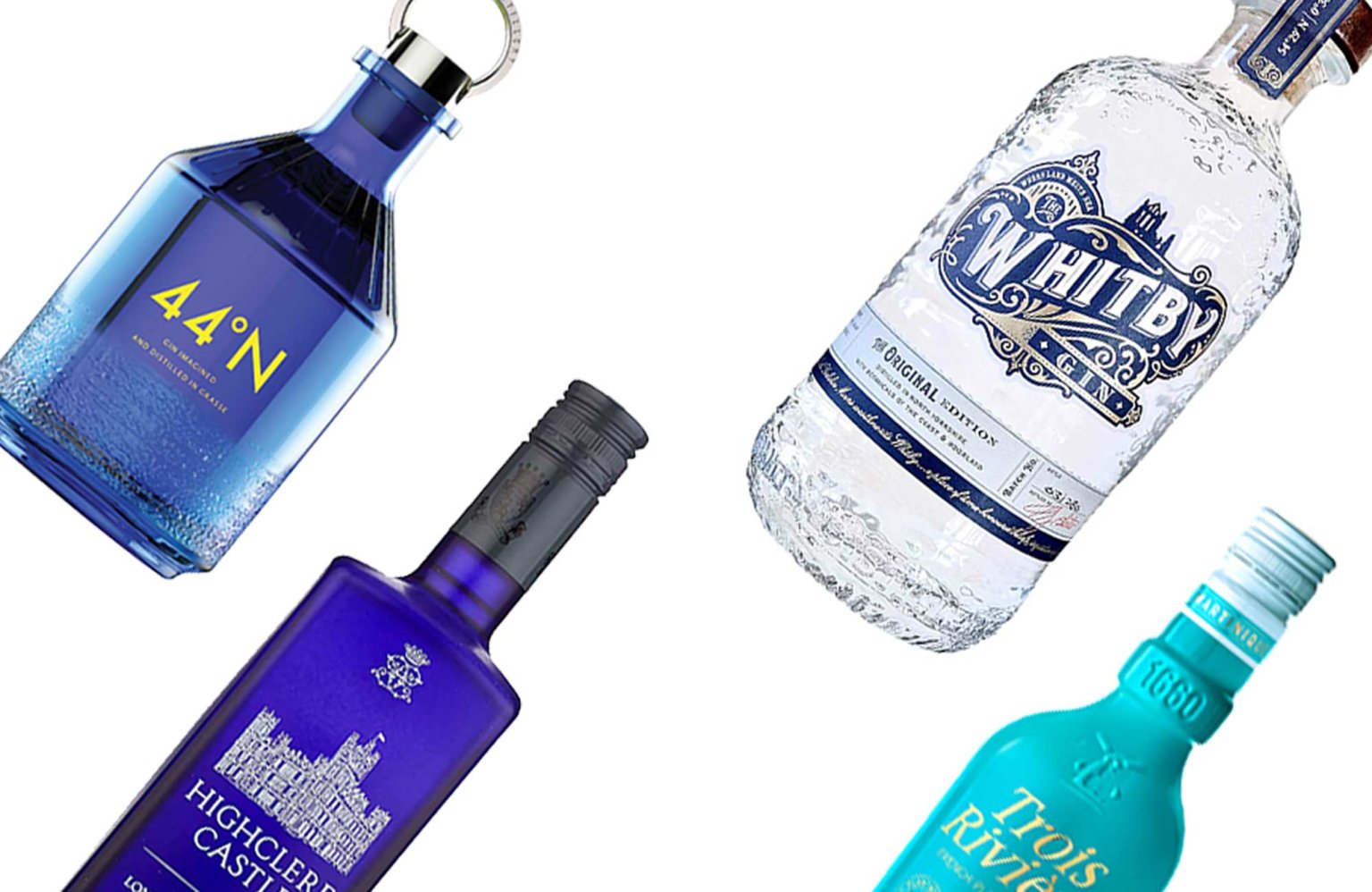 Glass,
in motion.A NEW PERSPECTIVE← SCROLL →04 / IMMERSIVE & EXPERIENTIAL↗ Parallax hero, oversized bottle renders and a horizontal story that flows into the next chapter.
Explore concept →STOELZLE COMPANY MARKET INNOVATION CONTACT
Homepage
structureIMAGE / FILM
05 / STRUCTURE & JOURNEYS↗ The proposed client sitemap, eight page templates and key user journeys, stripped back to structure.
Shaping
possibilities.ORIGINAL COMBINED DIRECTION06 / BRAND & BUSINESS — ORIGINAL↗ The original combined direction, before the larger type and stronger tertiary actions refinement.
Explore original concept →Shaping
possibilities.LARGER TYPE REVISION07 / BRAND & BUSINESS — LARGER TYPE↗ Larger text and stronger tertiary actions. Scroll corrected: only the bottles move, with the matching text and CTA fixed on the right. The earlier full-width text track is archived.
Explore version 07 →Product
& story.FIXED COPY / ROTATING GLASS08 / BRAND & BUSINESS — PRODUCT & STORY↗ Product on the left, with grouped copy on the right that changes by chapter. Gentle live 3D rotation.
Explore version 08 →From form.
To possibility.EDITORIAL V2 / SCROLL STORY10 / BRAND & REPUTATION — EDITORIAL V2↗ The original Editorial direction with a Petpak-inspired opening: a glass trio becomes one rotating bottle as the introduction unfolds beside it.
Explore Editorial v2 →